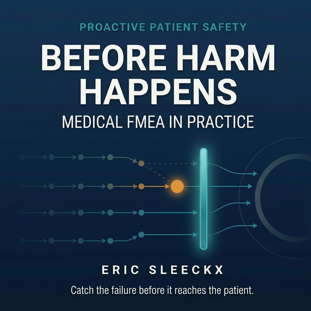
Some risks are too tangled to hold in the head and too important to leave that way. The bowtie diagram exists for exactly these, and its whole appeal is that it puts a complete risk story on a single page, in a shape anyone can read without training.
Picture a knot in the centre, the moment the risk is realised, which practitioners call the top event: the loss of control, the point of no return. To the left of the knot fan out the threats, the things that could cause the top event. To the right fan out the consequences, the harms that follow if it occurs. So far this is just cause and effect drawn tidily. What makes the bowtie useful is what sits on the fanning lines. Between each threat and the knot stand the preventive barriers, the controls meant to stop the threat from ever reaching the top event. Between the knot and each consequence stand the recovery barriers, the controls meant to limit the damage once it has. One page, and you can see the entire architecture of a risk: what could set it off, what stands in the way, what happens if those defences fail, and what would soften the blow.
The reason to draw one is not the drawing. It is the discipline the drawing forces. A bowtie made honestly makes you name the barriers that actually exist, one by one, on each line, and the honest version is usually alarming in a productive way. The left side often turns out to have three preventive barriers on paper and one that genuinely functions. The right side, the recovery barriers, is frequently close to empty, because organisations invest heavily in prevention and think much less about limiting harm once prevention has failed. The empty stretches of the diagram are the most valuable part, because they are exactly the places where a single failure runs straight through to a consequence with nothing in its way.
There is a further refinement that earns its keep. Barriers themselves can be weakened, and a good bowtie marks the degradation factors, the conditions that quietly undermine a control, along with the safeguards meant to protect the barrier itself. The double check degraded by chronic time pressure. The alarm degraded by fatigue. Drawing these makes visible a thing that lists of controls always hide: that a barrier which exists is not the same as a barrier that works, and that some of your defences are being eaten from underneath while still appearing on the diagram.
The bowtie is not a competitor to a full failure analysis, and it does not replace the harder quantitative work where that is warranted. It is a communication and thinking tool, and it is unusually good at one job: getting a group of people from different backgrounds to look at the same complete picture of a risk and agree on where the defences are real and where they are wishful. On a genuinely complex hazard, that shared page is often the thing that unsticks the conversation.
This article accompanies the book Before Harm Happens.